Tuesday, December 12, 2017

China paint suppliers and a link to using water based techniques

This tutorial is for large dolls but the tips should apply equally valid for miniatures! She is covering using the same dry china paints I use but with waterbased mediums.
http://www.stanecdolls.com/TechniqueSheets/chinapaintingtechniques.htm

I grew up with the oil based mediums and never so a reason to switch, but for those interested in exploring the waterbased method the above tutorial is very well done!

You can buy paint from the porcelain palace, they also sell the superb ultra chic porcelain slip. A good starter set would be first blush, dark nutmeg, black diamond, arctic ice, and smokey blue.
http://the-porcelain-place.mybigcommerce.com/doll-making/doll-china-paints-and-mediums/doll-china-paints/

If you are in the UK, you can buy Bell's china paints from Lydia's Doll Making Supplies.
http://www.lydiasdollmakingsupplies.com/bell-lead-free-china-paints-404-p.asp
A basic starter set would be autumn rose, blue velvet, midnight black, raisin, and frosted snow from the lead free range..

These same colors can be purchased in the USA from The Bell Collection, they also make the Gold Marque line of porcelain slips. If you prefer the china paints with lead get their gloss white, ebony black, rosewood, deep blue eyes, and brown sable.
https://www.bellcollection.com/popaint/body_popaint.htm


Saturday, December 9, 2017

History of color part 5

The Return of the Bustle


Oddly enough in 1886 the bustle tries to make a triumphant return, while short lived, the
fabrics were lavishly trimmed in such diverse furs as sealskin, sable, blue fox and
Canadian beaver. The colors were browns, maroons, lichen green, petunia, sunflower
yellow, maize, and deep strong blues. In men’s garments serge, twill, flannel, tweeds,
checks and stripes enliven day attire. Colors are still subdued with black favored for
formal evening wear.


The Gay Nineties

The early 1890’s did not see a change in fabrics but the colors took a discordant turn.
Yellow was in wide use especially for evening gowns with such vibrant new colors as
reds, heliotrope, pinks, lichen, and fawn. The men fashions merely added, as a variation
to their summer attire, white flannel trousers and dark coats.


  As fashion was heading towards the next century, the colors became even more virulent in women’s fashions. The fabrics had at least become lighter in weight and more delicate in texture. Men finally see the rebirth of the brightly colored waistcoats last seen in the Regency era; otherwise the colors remained unchanged.


Turn of the Century


Ah 1900 and a new century begins! The fabrics are soft and feminine, alpacas, mohairs, lawn, chiffon, muslin, and clinging velvets. Laces and other trims are used in abundance.
The colors were harmonious or monochromatic schemes with touches of strong pure
color, especially red. Men are picture perfect in neutrals, classic black and white for
evening and dark blues, greys, blacks, and silver greys frequently pinstriped.


Friday, December 8, 2017

History of color part 4

Victorian


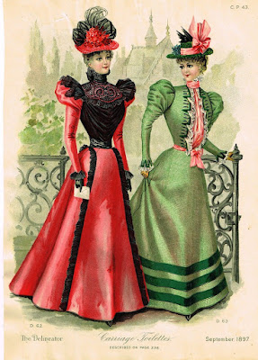
  As the Victorian era progresses even more materials are now available; including such luxuries as velvets, satins, alpaca, and rich silks. Life has gotten exciting with the advent of aniline dyes; with black and dark colors reserved

only for those in mourning or over the age of 40. And while you could never tell from the faded relics that populate our museum’s; the garments when new, featured brilliant and frequently shocking combinations of color. You had purple with cerise, and veridian with royal blue, etc..
  Regrettably for men the three piece lounge suit has made its appearance and now there are plaids, checks and other abominations to be seen sauntering down the street as well as the knickerbockers still on occasion seen at the golf courses of today!


 Mid Victorian


 The 1870’s: the bustle is becoming a fashion force with fabrics lighter in weight with such additions as sateens and cashmeres to choose from. Fabrics are striped, spotted, or are embroidered with small sprigs and the colors are mainly lights and pastels. Men’s fashions while mainly black are showing some striped fabrics occasionally used for trousers and the waistcoats have lightened and are showing some patterns.


 In addition to the fabrics used just prior to the 1880’s fur trimmings embellish mantles and coats. 

 Late Victorian

The late Victorian sees a narrowing of skirts and a diminishing bustle with Scotch plaids, serge, twill, velveteen and poplins swelling the fabric ranks. The colors chosen by both sexes is dark and somber and the costumes achieve richness by the juxtaposition of textures and the complexity of the trims.
  By the mid 1880’s the skirts are so narrow movement has been compromised and as to fabrics; for men checks and plaids made up into three piece lounge suits are very popular.The women have lightened and varied their palette greatly and soft autumn shades accented by bottle green and peacock blue are in wide use. 


Thursday, December 7, 2017

History of color part 3

The Romantic Era

The 1830s is the romantic period. This age sees more variety in fabrics with many woven or printed fabrics featuring a dark or black background. The fabrics are ginghams, foulards, chintzes, as well as the Regencies silks and woolens. With the new dyes available, richer and more intense colors are used in female fashions-sage greens, plum, old rose, amber, tobacco browns, etc. although it is difficult to imagine, men’s fashions became even more conservative with the waistcoat well-made of a very fancy material is almost invariably black.

Early Victorian

The early 1840s is the beginning of the Victorian period. Women’s fabrics now include taffetas and shot and watered silks. Black lace is now in vogue and the colors have become softer and more subdued. The colors in men’s clothing remains unchanged with a cut of the clothing is more restrained.


Victorian fashion sees the emergence of lighter colors for spring and summer
wear, which gladdens the female heart; while her mate is now wearing the precursor of the modern suit. Yes it is now that the colors of the coat and trousers match! The flounced Victorian skirts make good use of the printed or embroidered fabrics. Lace is also more widely used as it can now be machine made.


Tuesday, December 5, 2017

History of color part 2

    Where previously in human history, purples were reserved for royalty, the new dyes made this once precious and hard to attain color available to the masses. These new easily produced and inexpensive dyes were changing the very color of the landscape. At one time the lack of color in one’s attire quickly revealed your social status. Color has always been used to indicate social, religious, and political affiliations.
 
  What follows is a breakdown in western fashion from 1790 to 1920 as regards to colors available and used. My main reference material is a book I consider an absolute necessity for the historical costumer; The Evolution of Fashion by Margot Hamilton Hill and Peter A. Bucknell. This amazing book covers in detail over 46 separate periods in fashion dating from 1066 to 1930. Not only does it cover colors and fabrics used for both men and women, but it also has detailed diagrams of actual pattern pieces. You can purchase this book online from https://www.amazon.com/Evolution-Fashion-Pattern located within the
United States. 

    One of my favorite places to buy used books is https://www.thriftbooks.com/ If you need to do research on an obscure era, you will find google a highly reliable search engine. Additional help can be found at many local libraries  They are not limited to the books on the shelves. At least in the United States, they have public computers connected to the Internet for patrons and the librarians are skilled in locating information as well as subscriptions to various universities' libraries.

Neoclassical


  In 1805 the neoclassical influence was rampant in Western fashion; it was also referred to as the King George III period. The fabrics available were wools, muslins, and soft silks. Colors were very conservative for both men and women; with the masculine attire dominated by dark blue, black, or bottle green for their coats and unimaginative white for their breeches. What little color in the men’s garments was restricted to the waistcoat. At this time the development and introduction of bleach made the classically influenced white dresses that were universally worn by the fashionable females, easy to maintain. These high-waisted fluid gowns owed any color available to the trimmings and accessories used to adorn the costumes.


Regency


By 1815 the Regency period was beginning to commence; while the fabrics remain the same, many of the cambrics and muslins now featured delicate all over embroidery in sprig patterns. In color, white still predominates but soft and light colors have begun to appear in female fashions. As the era progresses pinks, blues, yellows, and greens are seen more frequently. The men’s clothing while still reflecting the previous period, now also utilizes light shades for the breeches even though white is the most common.


Late Regency

In 1825 as the Regency era begins to wane, commonsense is beginning to prevail. No longer are women expected to wear flimsy garments irregardless of the temperature of the season. Heavier more somber woolens in silks reign in the winter with the lighter cottons and muslins of early Regency reserved for the summer. 


While the debutantes, are
still promising buds in the lightest pastels; the young married matrons are choosing lilacs, pinks, amber, and the not quite so young matrons are favoring Indian red, browns, and blacks. 


For the men day attire remains basically
unchanged while for evening wear black
pantaloons, trousers or breeches are teamed 
with a black or dark blue coat and a black 
or white waistcoat. 


Monday, December 4, 2017

History of color

 
The use of color for many years was limited to dyes that could be distilled from living organisms. Some of the names that we associate with particular colors are actually the names of the plants from which the colors were derived. Indigo produced a lovely blue and the madder plant an exceptionally deep rose. 
  After the Age of Enlightenment, the twin fields of chemistry and science began to add new and varied colors for the fashion conscience. For those who have only been exposed to historic costume through actual relics of a bygone age, the vibrancy of the colors when new is surprising. Garments that are now 100 to 200 years old are very muted in appearance since the dyes utilized did not have color fastness of modern dyes.
 

  The very first synthetic dye was Prussian blue. Like many great discoveries, it owes its development to accident. A Berlin color maker was actually trying to produce a new shade of red for oil painters. And imagine his surprise; when his solution turned purple before finally solidifying into a shade of blue. The resulting Prussian blue dye was used from at least 1723, mainly on the natural fabrics silk and cotton.
 Other developments in science led to the prism; and it was experiments in refracting sunlight through a prism, that allowed scientists to discern all the colors of the rainbow. This color spectrum is what we now see on a color wheel and is used as the basis for our current theories of color.
  The art of dying was so important that it was actually listed as a separate branch of chemistry. A lot was achieved through trial an error, and the results were not always understood on a chemical level. Remember this was the age of apprenticeships rather than formal schools of study; and hence dying remained more of an art than a science. 
                             
  In the 1770’s, two new yellow dyes were developed  picric acid and quercitron. As the previous sources of yellow were either hideously expensive like saffron or produced a more muted, less radiant yellow, like turmeric; the new yellows took the fashion world by storm.


Toward the end of the Regency, the compounds of different dyes were beginning to be isolated and this paved the way in the Victorian age for the new dyes such as mauveine, murexide, and French purple. Thanks to these new dyes a fashionable lady could now adorn herself in lovely shades of mauve, violet, and blue. 
   
  In addition 1859 saw the introduction of magenta, shortly followed by aniline blue and aniline violet. In 1868 synthetic alizarin dye was introduced to the market to great acclaim and resulted in the sudden death of madder production in many areas of the world. This bright red became a staple in the Victorian color palette. The ladies of the period rejoiced and small fortunes were made in the dye industry.
   The next great discoveries in this field were the production of various green dyes.


This was the age in which synthetic dyes became more predictable and their manufacture and development was based more in science than in luck or art. Germany became a leading force in the dye industry. Color after color after color was being introduced to a readily appreciative audience.


Friday, December 1, 2017

The Yellow Pages and local kiln companies

  Good morning, today I added a page for locating books, magazines, and miniature doll patterns. I will add to it as time permits. I also updated the wigging tutorial page with info on wigging tiny dolls
as well as updating sources for porcelain blank and painted kits. My aim is to add or update resources at the tune of three a day. Please realize I am a hunt and peck typist and if you send me a link it may take a few days before I can get it up and running.
   I was thinking back when I just got started in dolls I remembered how nice it was that the Blue Diamond Kiln company was literally right down the street from me! Whenever I had an issue or needed to have the kiln elements replaced, help was literally in walking distance. There are a lot of small regional kiln companies spread out all over the USA. It never hurts to check your local Yellow Pages and see if you have one within your vicinity. As an added bonus a local company may very well have scratched or dented merchandise marked down to a very reasonable price! Even if you do not have a local manufacturer, you might find a distributor for one of the larger companies that also does repair work. If you know you're not going to feel comfortable repairing your own kilns (you will at least have to replace elements), it would be a smart choice to buy a kiln that you can have worked on locally. Remember not all of the smaller kiln companies will actually have a website. If you cannot research a kiln company on the Internet just give them a call. Specify that you are looking for a small kiln that can go to cone six and run on regular household current. If you find or know of a smaller regional company that you'd like to add to this list just drop me a line!

Blue Diamond Kilns Metairie, LA  1-800-USA-KILN

Vulcan Kilns, LLC Centerville, Ohio 1-937-433-1833

Thursday, November 30, 2017

Digital Kilns a guide for the techno challenged! by Kati Mahdavi

Don’t let digital kilns scare you away! Their complex programming capabilities seem intimidating to the first time doll artist, but do not fret. They are actually a lot more user friendly than you may think. The firing process will become a lot easier once you get past the first few firings. The wonderful thing about digital kilns is their ease of use. They are able to retain segment programs of your choosing until you decide to change them. You are able to program things such as heating speed, maximum temperature in a specific segment, and the time it will hold at that segment. Most digital controllers come pre-programmed with firing schedules for a variety of different projects. If you do choose to customize your own program firing, the controller can store many different your personalized programs that you’ve formulated. With this feature, you don’t need to worry about recreating firing schedules for a project you plan on doing more than once. You can set your most commonly used firing schedule at Program 1 (PROG 1) and your second most common firing schedule at Program 2 (PROG 2).

Some symbols that you will need to know are RA (Rate per hour), TEMP (temperature you want the kiln to get to in that segment), HLD (time you would like the kiln to hold at that temperature), PROG (program), and STRT (start). Once you press start, you will hear the kiln begin to click, which is completely normal.

 Certain factors, such as brand, kiln model, age of kiln, and location all affect the way your kiln will fire. All kilns fire differently and certain temperatures may need to be adjusted, so experimenting with different firing programs is a great way to start. Try firing some “mess –up” bisque pieces for these experiment firings, just so that you can get a feel for which program yields the best results for you without ruining your good bisque in case the kiln over-fires. Sometimes firing at a true Cone 6 can be too hot and you may end up with over-fired pieces (indicated by little white dots on the porcelain). In this case, try firing to Cone 5 or Cone 4 and see if this changes the results. If your porcelain is under-fired, try adding a hold to the next firing. This should correct the under-firing. However, use holds with caution because it can easily over-fire the bisque if you accidentally enter 2 hours (02.00) instead of 20 minutes (00.20) of hold time. Experimenting at the beginning really helps the first time kiln user with establishing a good firing schedule.

 There are many advantages of digital kilns:
·       -They offer a variety of tools that provide you with more information, more accurate temperatures, and solutions   for fixing various problems that may arise in the kiln
·       -They are able to better inform you before and during the firing process
·       -Give you the freedom to go about your day instead of constantly monitoring your kiln for multiple hours
·       -More user control with setting customized programs
·       -More consistent results
·       -Peace of mind knowing that your firing will go exactly how you programmed it to, every time

The Crystal Palace: a Victorian time capsule by Jacob Hofman


  The Crystal Palace was the brainchild of Prince Albert and was designed to showcase Britain’s industrial achievements in a great exhibition to be held in London’s Hyde Park. This great exhibition was to be international including France, the United States, Russia, Egypt and Turkey. The exhibits were divided into four categories raw material, machinery, manufacturers and the fine arts. 

  The palace was designed by Sir Joseph Paxton and was a massive complex constructed mainly of glass and iron. Amazingly enough after the exhibition closed in October 1851, it was completely torn down and moved to the Penge Place estate in Sydenham to essentially become England’s first theme park!


  The rebuilt structure was over 1800 feet long and 408 feet wide. It had many interior fountains as well as lavishly landscaped inside and out. Picture a truly massive conservatory.


  The Crystal Palace became an extraordinarily successful venue hosting events that ranged from educational, musical, scientific displays, as well as cricket matches. Each of our time capsule blogs will highlight an event or an invention featured at the Crystal Palace during the Victorian era.